Project information

CONSTRUCTCONNECT SAAS SOFTWARE

The Problem Combining 8 Legacy Softwares

Our key problem was taking eight legacy products and combining them into a single software. This meant we had to combine key functionalities of each product and redefine the overall experience to build an entirely new platform.

My Role: UX Manager

I started as a UX Designer and was promoted to UX Manager within two year. I was at the forefront of all new product releases to ensure a cohesive experience for our users. I accomplished this by bridging across several design teams. Since I worked with lots of team members, leadership assigned me to help mentor junior UX Designers.

The Obstacle :  Construction is a Fragmented Industry

Our software spans across the entire construction industry. Therefore, I had to design with the “bigger picture” in mind so the experience would flow smoothly. I researched the interconnections to try to find solutions for a fragmented industry. View More

The Approach: Integrate into The User’s Workflow

Because construction is so varied, every company has a different way of handling the same processes. Our eight Legacy Softwares each addressed one major facet of the process. Therefore, we could blend the best parts of each software into our Users’ current workflows, with the advantage of access to existing user groups. Using existing infrastructure allowed us to get to market more efficiently. View More

The Plan: User-Driven Design

We conducted extensive research to discover universal pain points in the pre-construction phase. The research steered our design decisions, and we reviewed the resulting prototypes with our Users. Using their feedback, we modified and refined the solution. We created final mocks and moved into the development stage. During development, I acted as support to fill in any design gaps and reviewed the final designs.View More

The Obstacle
Construction is a fragmented industry

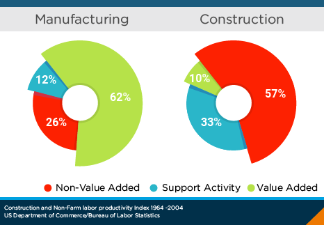
Construction productivity has decreased due to wasteful activities such as extra processing and plain old waiting around. Our research indicated the waste was due to the way the industry is structured. Our challenge was to help cut down on wasteful activity by connecting our Users’ workflows through the “OnePlace”.

Wasted Time and Effort

Our research found a huge reason for the overhandling and waiting is due to a lack of conformity within the industry – multiple entities “work together” (Architects, Engineers, Trade Contractors, General Contractors, Suppliers, etc.) – but they all have different ways of handling similar information. For example, how a General Contractor presents information to an Architect is very different from how they present it to a Trade Contractor. This creates an enormous volume of non-value-added work for the User, but a great opportunity for us.

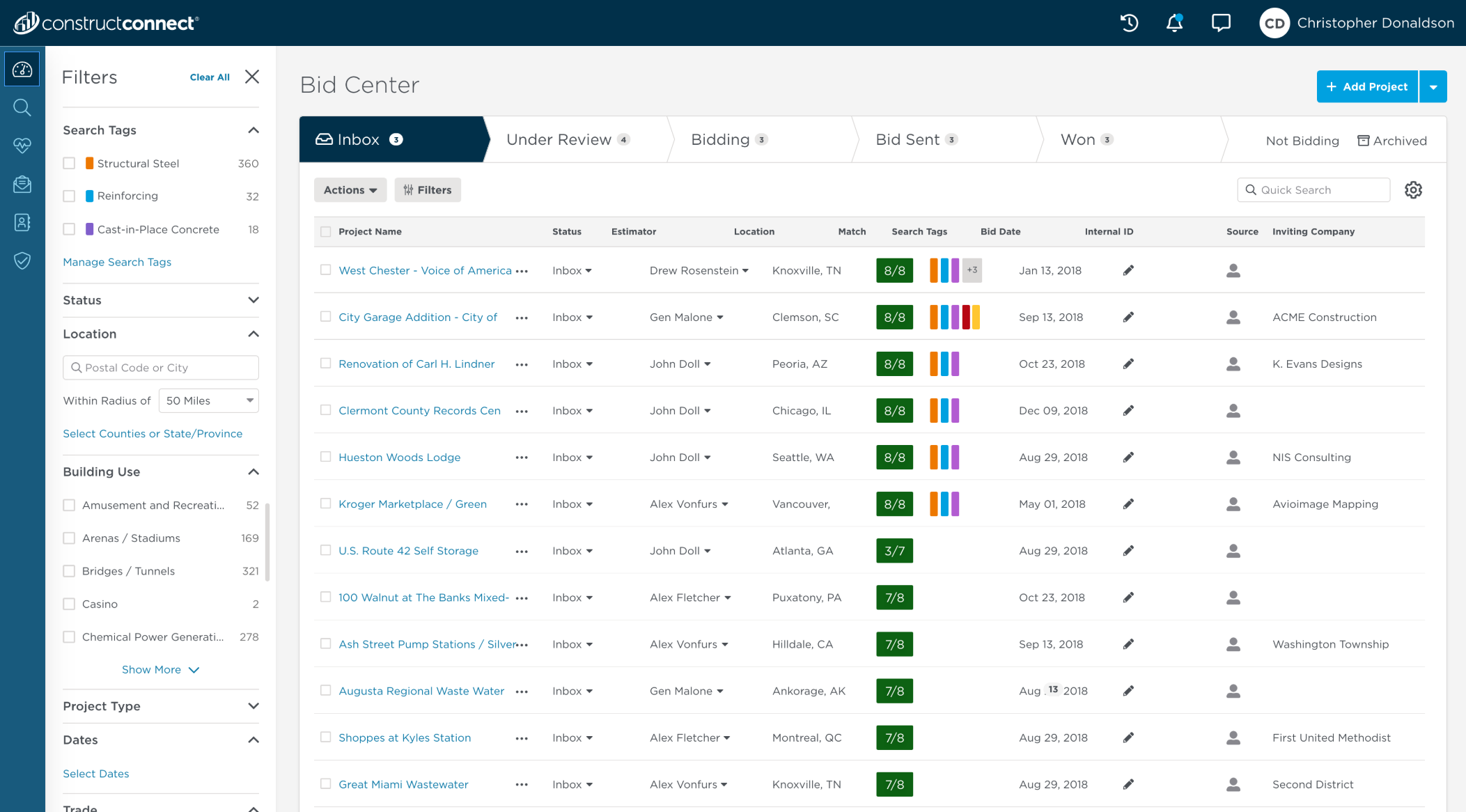
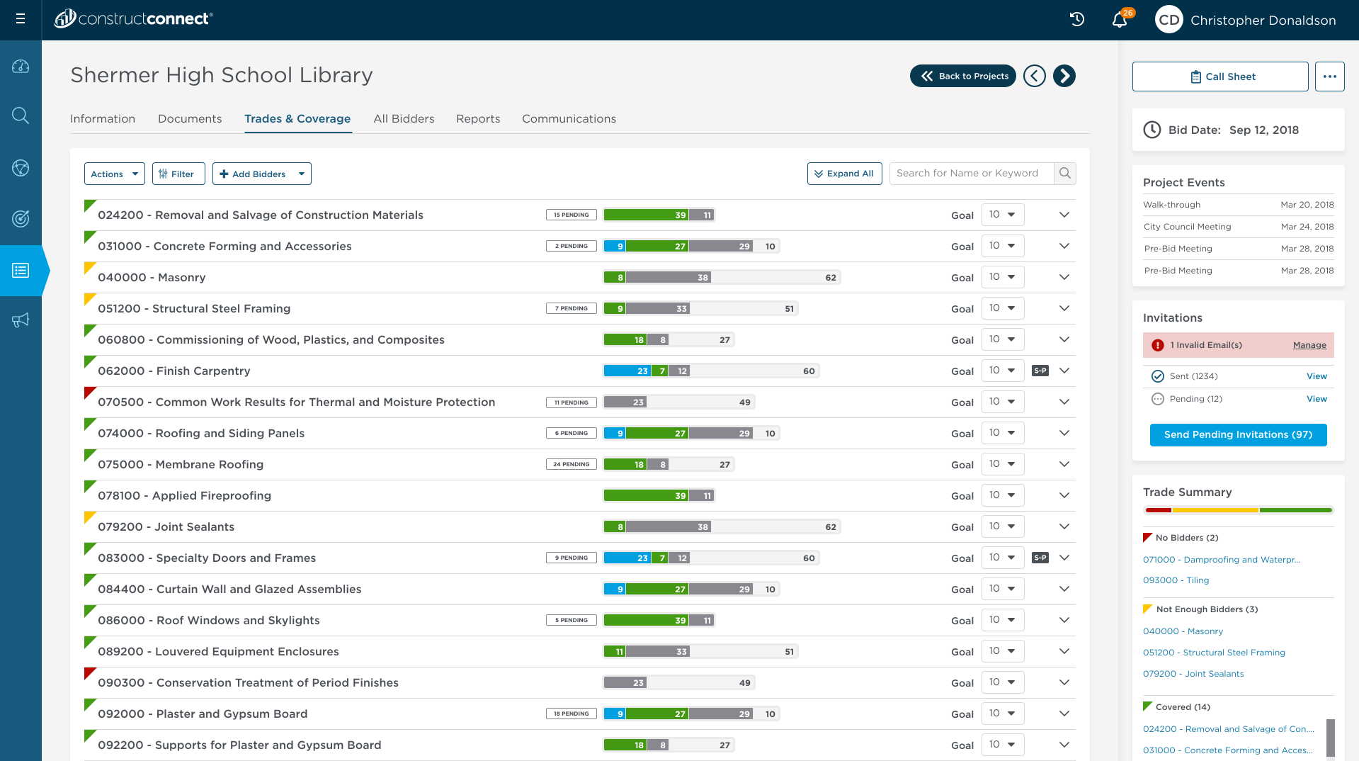
Bid Board

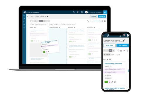
For example, let’s dive into how Construction Firms win work. General Contractors receive documents from the Architect. They then create a Project and ask Trade Contractors to submit a price. This seems straightforward, but it isn’t. Architects, General Contractors, and Trade Contractors all use different forms, naming conventions, document sharing platforms, and honestly too many other things to mention. This creates an enormous amount of stress when General Contractors submit the final price to the Project Owner. We created Bid Center so every company could continue to manage their projects using their own workflows while staying better connected to the other players.

The Approach
Integrate into the User's Workflow

Because construction is so fragmented, we couldn’t rely on using the delivery method (how the project is bid) to develop our software. Instead, we relied on the relationships between the different stakeholders – Architects, General Contactors, Trade Contractors, Suppliers, and Manufacturers. Our eight Legacy Softwares addressed one part of the connection – but addressed it independently of the other relationships. Our task was to connect all eight parts to make the circle, the “One Place”, complete. We assembled detailed Personas to break down how each stakeholder saw their contribution to the construction process. Using that knowledge helped us understand the essential parts of the Legacy software and then stitch those parts together in a manner that enhanced their workflow.

The OnePlace

ConstructConnect’s goal is to be the “One Place” where people from all segments of the construction industry connect and confidently evaluate, choose, and prepare projects before they build. To reach this goal, we had to understand how each segment contributes to the whole, and how they interact with each other. Typically, companies have handled these interactions separately and with multiple softwares, which left blind spots at critical points in the construction process. Therefore, segments that did not directly contact each other were frequently left out of interactions they could have benefitted from. The One Place was designed to remove these blind spots and create transparency that benefits everyone.

The Persona

From our research, we identified 26 unique roles across the construction industry. Each role had different needs, wants, and expectations for how software could benefit their current workflow. We consulted with our in-house experts to develop high-level themes for each role. We then spoke directly to Users who matched the roles to fine-tune each Persona and flesh out detailed goals, challenges, motivations, and buying habits. These personas allowed us to see which parts of the Legacy softwares were beneficial to developing the One Place, and which parts we needed to modify. We keep the Personas updated on a regular basis to ensure we are always working toward our Users’ goals. All Persona

The Strategy
User Driven Design

Our first task was to interview companies to understand their workflows and the pain points associated with them. Next, we held design studios with all the stakeholders to brainstorm broad solutions. From there we developed prototypes to test with our Users. We returned to the initial companies to see how well our potential products would integrate with their workflows. We used their feedback to adapt our designs. Once we were confident our design was the best solution given our backend infrastructure, we moved on to developing our product for release. At this point, I supported our offshore Developers during the development process.

Journey Maps - Learning the Workflow

Product Owners bring us problem statements that they think are current pain points, but they might just be feature requests. Features can be driven by wanting to retain the Legacy softwares’ Users, security concerns, or offering comparable products to our competitors. As Owners of Experiences, we’re the voice of the Users. The User Journeys are a tool to help us understand problem statements and rank the importance of feature requests.

Whiteboards- Understand the Idea

Once we understand if the need stems from a problem statement or a feature request, we move to the brainstorming stage. We find Whiteboarding is the fastest and easiest way to generate lots of ideas. We can then rapidly iterate designs based on input from all the stakeholders. We take photos of the Whiteboards so we have records we can refer to during the design phase.

Prototypes - Create the Idea

The next step is to partner with Technical PMs to translate the high-level concepts from the Whiteboards into low-fidelity design prototypes. We use Adobe XD to create the interactive prototypes. These mock-ups allow us to communicate our ideas to the Users so we can see if, on a high level, our designs integrate into their workflows. As Senior UX, I also review other UX Designers’ work to ensure their designs create a uniform experience across our platform.

Research -Confirm the Mocks

Once we have a working prototype, we solicit feedback from people who fit the use case. The UX designers and Research team develop a script to guide the interviewee through different scenarios they might encounter with the software. We use the feedback in two main ways. First, we refine our prototypes to make sure our software aligns with the mental model from the VOC. Second, we gather information on general trends and use them to guide future roadmaps. We store all the information on a companywide platform that is accessible to everyone connected with this process

UI Layer - Finlizing the Design

Product Owners bring us problem statements that they think are current pain points, but they might just be feature requests. Features can be driven by wanting to retain the Legacy softwares’ Users, security concerns, or offering comparable products to our competitors. As Owners of Experiences, we’re the voice of the Users. The User Journeys are a tool to help us understand problem statements and rank the importance of feature requests.

Tweak-It Stage

Our work doesn’t end after the product is shipped – we keep looking for ways to improve even after the product goes out. The Sales and Customer Support Teams conduct usability tests developed by the UX Team to understand how our product is used in the real world. Is it easy to use? Does it streamline workflows? If so, by how much? We crunch the numbers and identify major findings, like the average time to complete tasks and success / failure rates. We also collect recommendations from the participants for ways to improve upon the effectiveness and efficiency in future releases.

Our Design Principles 

These Principles guide our Team’s decision‐making process

Show the customer we know them

Earn our Users’ trust. Show them how our software will integrate into and enhance their current workflows.

Avoid Dead ends

Construction is done in phases. We need to design products that work with these phases, not against them.

Build for Customers on-the-go

Our customers don’t always work at a desk. They move from site to site. We need to design a system that is as easy to use in the field, as it is to use at a desk.

Fit and Finish Matter

Big picture, our customers want something that works. Little picture, they stay with us because we deliver a great experience. We deliver pixel-perfect designs that are sprinkled with little extras that show our customers we take pride in our work, just like they do.

Design for the Complete Experience

Everyone uses our software. Therefore, our designs must consider perspectives of everyone who will use it. We can’t design for one segment over the other.

Enhance the Workflow

Every company considers their workflow to be the “right way” – and each company’s workflow is different. We design a system that is fluid enough to blend in with every company’s current workflow to increase retention and adoption.

Contact Me

Having issues getting your ideas put into play? There is a solution. Share your views with me...