
Project information
- Category: Embedded Software
- Client: Touchpoint Medical
- Project date: 21 May, 2018
- Project URL: medDispense® C series
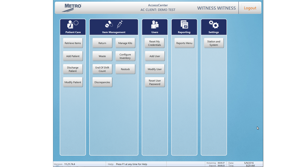
medDispense® C series Automated Dispensing Cabinets
The Problem
: Embedded Software with No Documentation
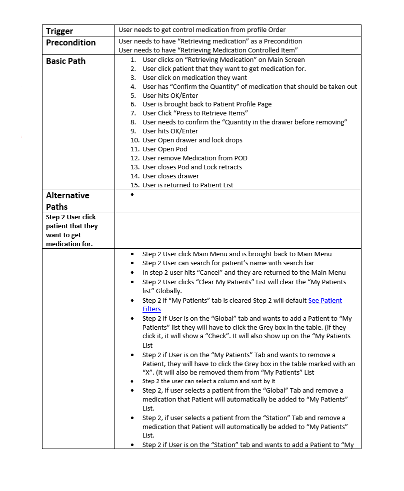
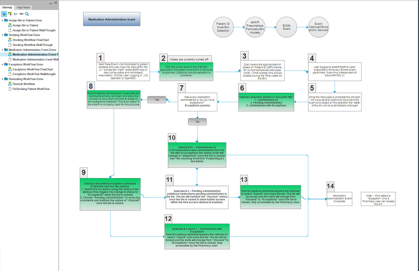
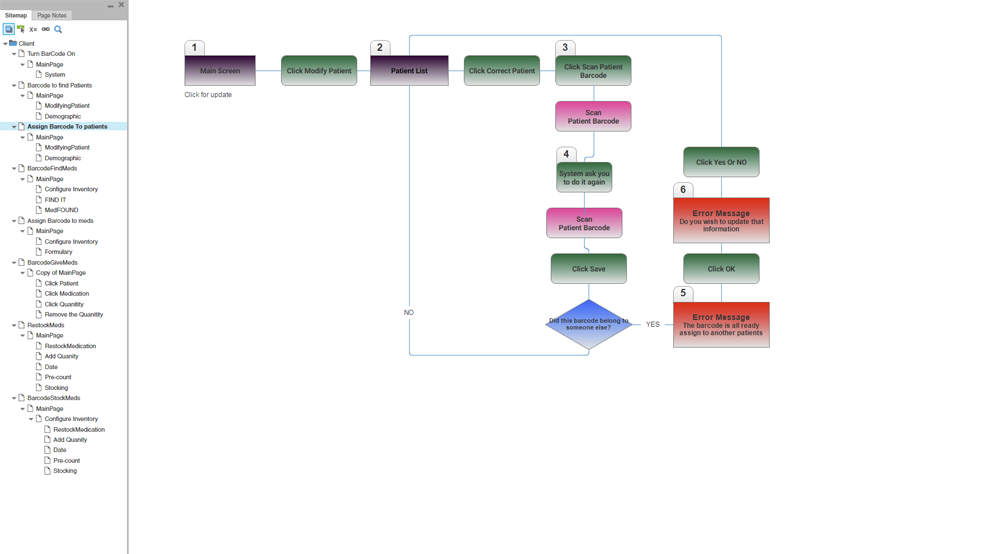
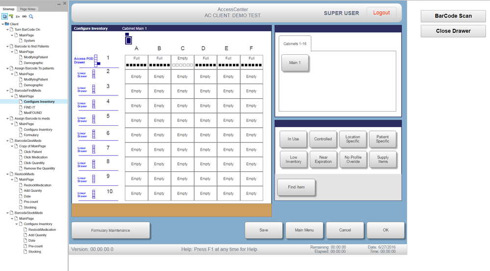
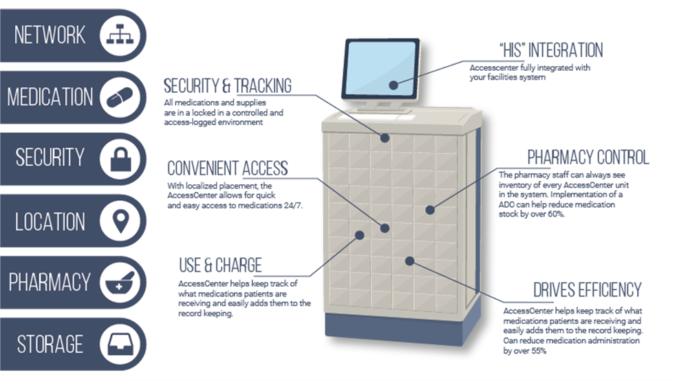
Touchpoint develops both the hardware and embedded software for Access Center, which hospitals use to dispense medicine. I was in charge of creating new features for the Access Center – but there was a big problem. The software was over 10 years old and developed for an outdated version of hardware. I quickly discovered that, due to its age, any original documentation explaining software requirements was nowhere to be found. I had to simultaneously develop new features and re-engineer the software so I knew how the different elements would interact with the new features.
My Role: UX Designer
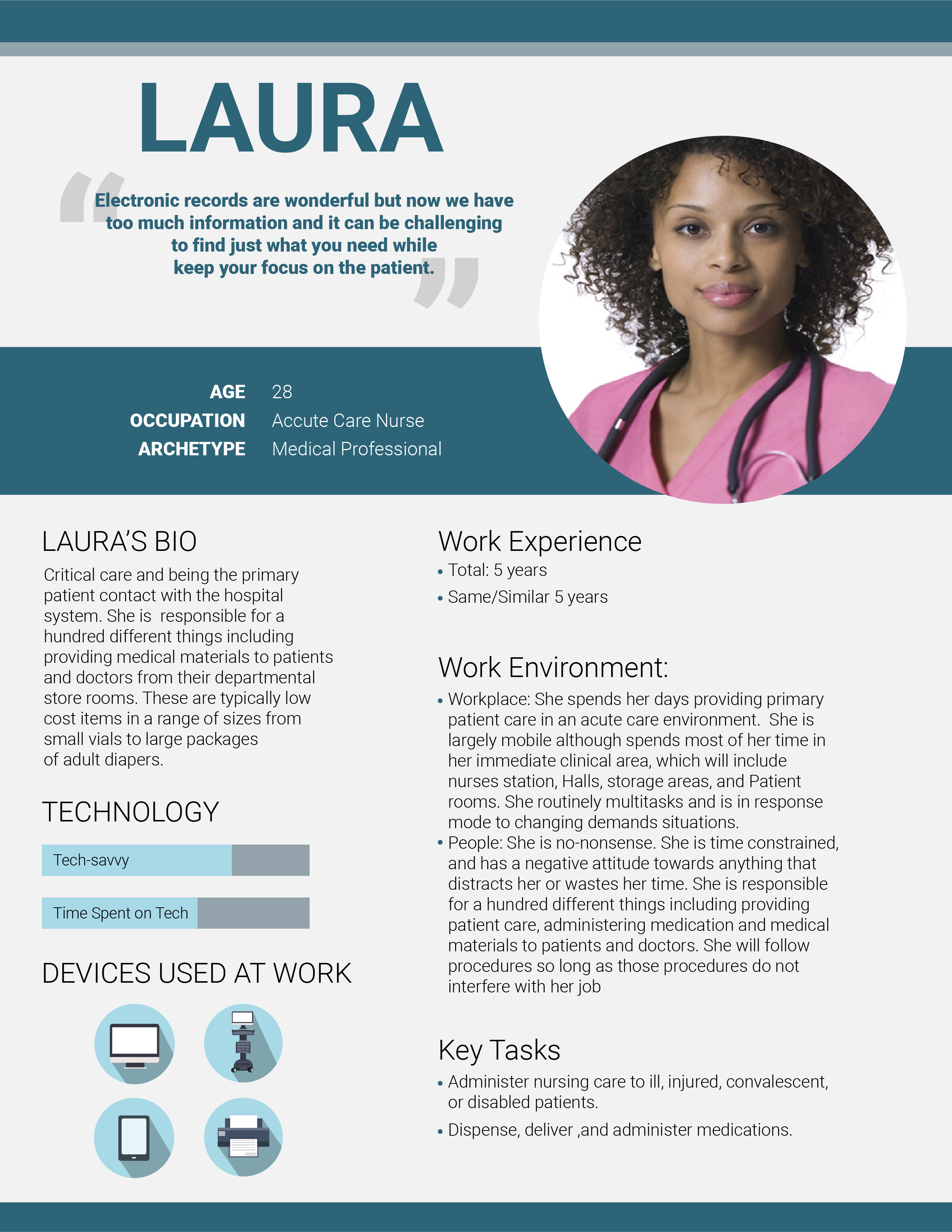
My team consisted of me, software developers, and hardware engineers. I was hired as the Ux Designer but wore several hats, including software designer, QA, and being the main point of communication between our office and the office in Xi’an, China.
The Obstacle : Aligning with Stricter Regulations
At the time, California passed a new law on how to handle certain medications. Therefore, we had to update the way the hardware worked. That also required new software, because it needed to align with the new hardware designs. View More
The Approach: Balance Needs of Nurses, Pharmacists, and Executives
Our battle was balancing a great user experience with meeting very stringent, mandatory regulations. We had to satisfy requirements from the Executives, Pharmacists, and Nurses. The sweet spot was when we created a great daily experience for the Nurses, met the restrictive regulations imposed on Pharmacists so they would feel comfortable with the machine dispenser, and made it affordable for the Executives. View More
The Plan: Remove Unnecessary Steps, Keep Mandatory Regulations
We regularly went to the hospitals to see how the Access Center was used. We learned which workflows slowed the Nurses down and how they would adjust to work around bottlenecks. They had to care for several patients, so streamlining the medication distribution was critical. We improved the warning notification and end-of-shift counting systems, so the Nurses spent less time at the computer. These changes allowed them to access the medication faster while continuing to meet the mandatory regulations.View More
